Form Builder
Key Teammates: 2 Product Managers, 1 Eng Lead
Duration: 2.5 Months
Role: Lead Product Designer
I redesigned an internal tool for customizing expense forms to be client facing, so that customers could reliably and easily customize expense forms themselves.
Brief
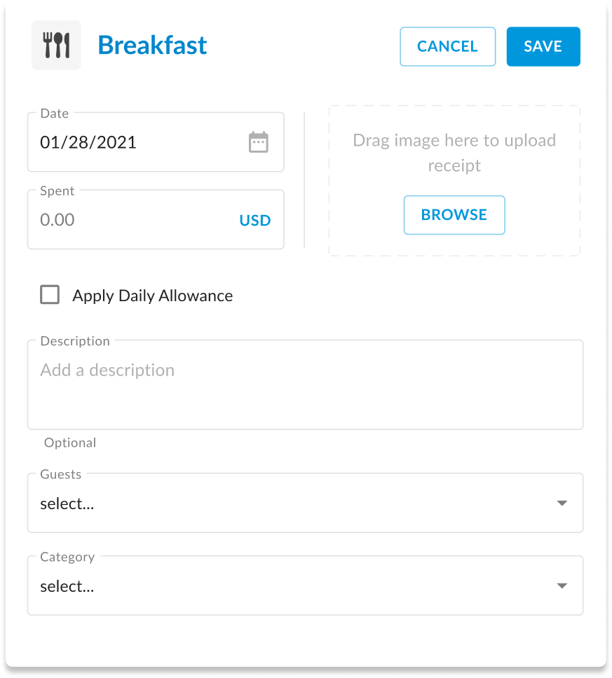
Employees may need to fill out different fields depending on what they’re expensing. For example, Hotel expenses have check-out dates. Expensing a meal might involve reporting which clients were present. Within Expense Management software such as Chrome River, this is resolved by creating unique forms for different expense types. These forms tend to be highly specific to each client. Furthermore, the people responsible for these forms tend to fall into two distinct categories.
Pablo - Expense Admin (external user)

Pablo is an expense administrator for a large university. He is in charge of setting up expense software. They have a very complicated configuration. There are different departments that have different expense policies. There are intricate routing rules for approving expenses. There are also strict policies around expensing that must be enforced.
His primary goal is to optimize the process of expensing, while minimizing the risk of expense fraud, or out-of-policy expenses.
Ruth - Account Manager (internal user)

Ruth is an account manager at Chrome River. She handles initial setup for new clients at Chrome River, as well as maintenance and updates for existing clients. Clients tend to have complicated setups, as well as constant needs for changes and updates. She builds expense forms that clients will use, as well as any custom fields or conditional logic associated with these.
Her primary goal is to be more efficient, and spend less time on basic setup and updates for clients
The Expense Ecosystem
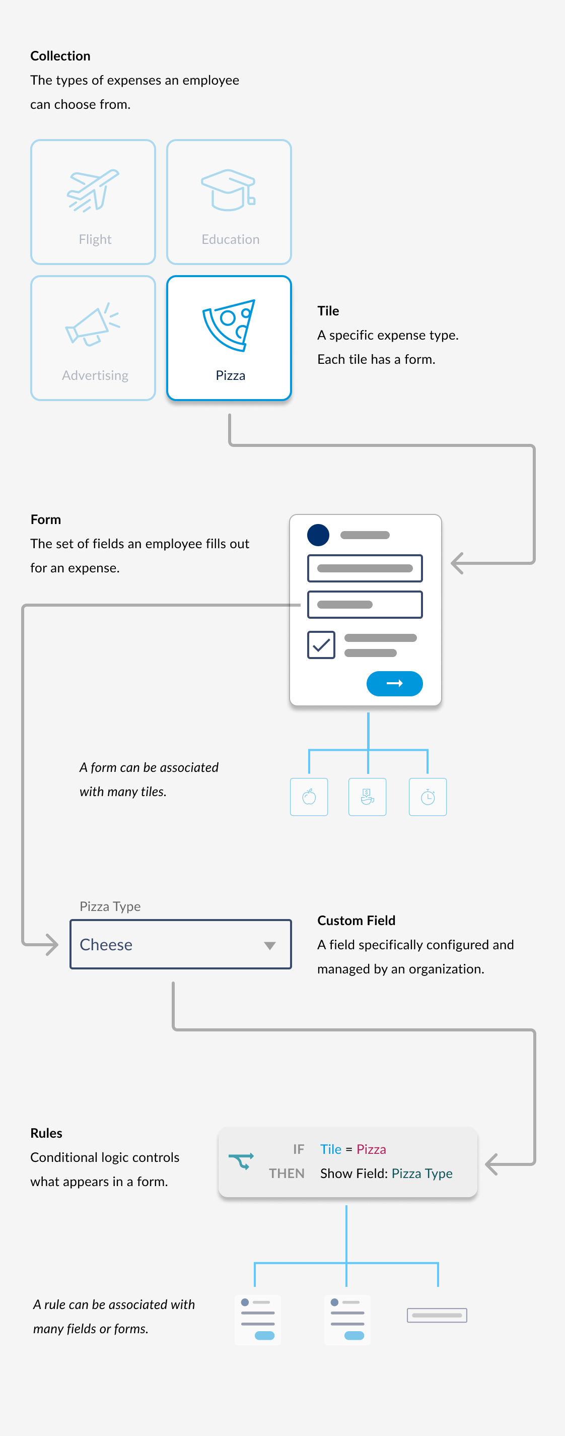
When Employees go to expense something, they choose an expense tile. They are presented a group of tiles to choose from, this is called a collection. Each tile is has a form, a set of fields that need to be filled out. A tile can only have one form, but that form may be used for many different tiles. A form is composed of fields. Many of those fields are custom fields created and managed specifically for that organization. Lastly, forms and custom fields often have rules, or conditional logic dictating how (or if) fields will be displayed. Rules may also modify options available in a field, or update it's value. A single rule can be associated with multiple forms or fields.
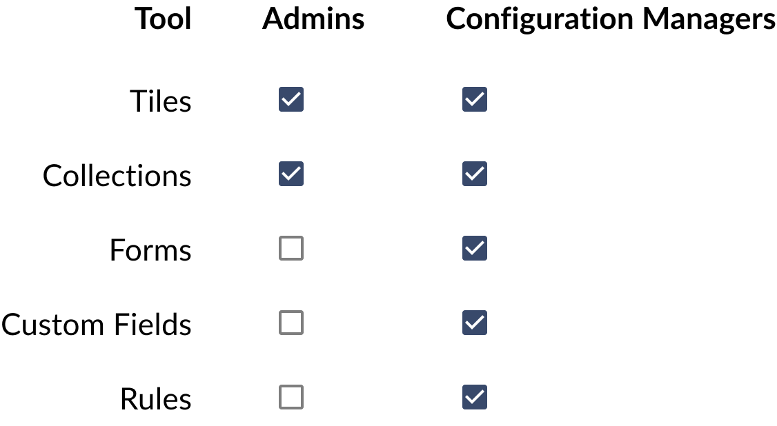
The Tools Ecosystem
There is an individual tool to handle tiles, collections, forms, custom fields, and rules respectively. At the onset of this project, the only tools available to admin were tools to manage tiles and collections. Configuration Managers had access to internal tools to manage all of this.
Chrome River’s goal was to make all of these tools available to clients by the end of 2021. Creating a client-facing Form Builder was the first priority.
Key Project Challenges
Discovery Research
My first priority was understanding this very complex tool. I spent much of the first week exploring the ins and outs of the tool. There were many usability issues due to this being a homegrown tool. I did some informal heuristic analysis to get a sense of the most severe defects. I followed up with a couple of Q&A sessions with PMs about the rationale (or lack of) for some of the more critical product defects.
Many visual design issues in the homegrown tool that could be enumerated on, but they will be resolved when I apply the client facing design system. Addressing UX was the main focus and challenge in this project.

Task Flow
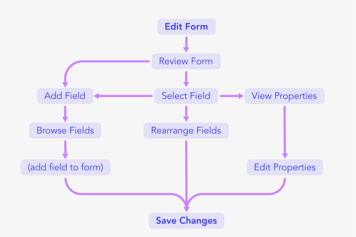
Exploring the product and doing heuristic analysis, I was able to produce a task flow for the core functions a user could take within the editor. Everything is based around adding, or modifying fields, as well as rearranging their order within a form.
I had a good idea of what the product was, but still lacked an understanding of who uses the product, why they use it, and when. I had an additional week for discovery research, so I conduced interviews with configuration managers
Interviews

A good service is only as strong as its weakest link.
I considered a few examples of tasks admin might take, and created an experience map for all of the tools they might have to interface with to answer a simple question. I paired this with a consideration of the state of the tools ecosystem once Form Builder was available for client use. The tools would still remain disconnected.
Admin should be able to answer their questions or solve basic tasks within the same editor, without having to open up multiple tools.
I spent some time doing analogous research on other popular content or form editors. I looked at Google Forms, Squarespace, Notion, and even JIRA.
Key Insights

Analogous Product Research
I didn’t have time to recruit external user admins to interview, but I could easily talk to configuration managers at Chrome River. They serve client requests within the Form Builder, so they tend to know the use cases of Admins, and were an excellect substitute.
I wanted to understand common use cases, as well as uncommon ones. I also wanted to validate the issues I discovered exploring the product, or uncover new ones.
Design

Option 1:
I proposed a WYSIWYG editor, similar to Squarespace or Notion. This was the most ideal UX for editing forms and seeing changes.

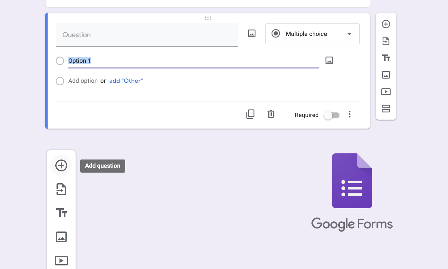
Option 2:
I proposed a stacked-cards style, similar to Google Forms. This UX was less ideal but simpler to build.
Engineers saw some major feasibility hurdles in Option 1, mostly relating to the way CR renders forms. So I proceeded with the collapsed cards approach (Option 2).
List View
I implemented the redesign by leveraging a new design system established across Emburse. In this case study I'm showing mainly final wireframes, and annotating some of the decision making behind the UI, rather than focusing on iterative screens.
After we decided on a collapsed cards design, I proposed a 3-column layout for the Form Builder.

Adding Fields
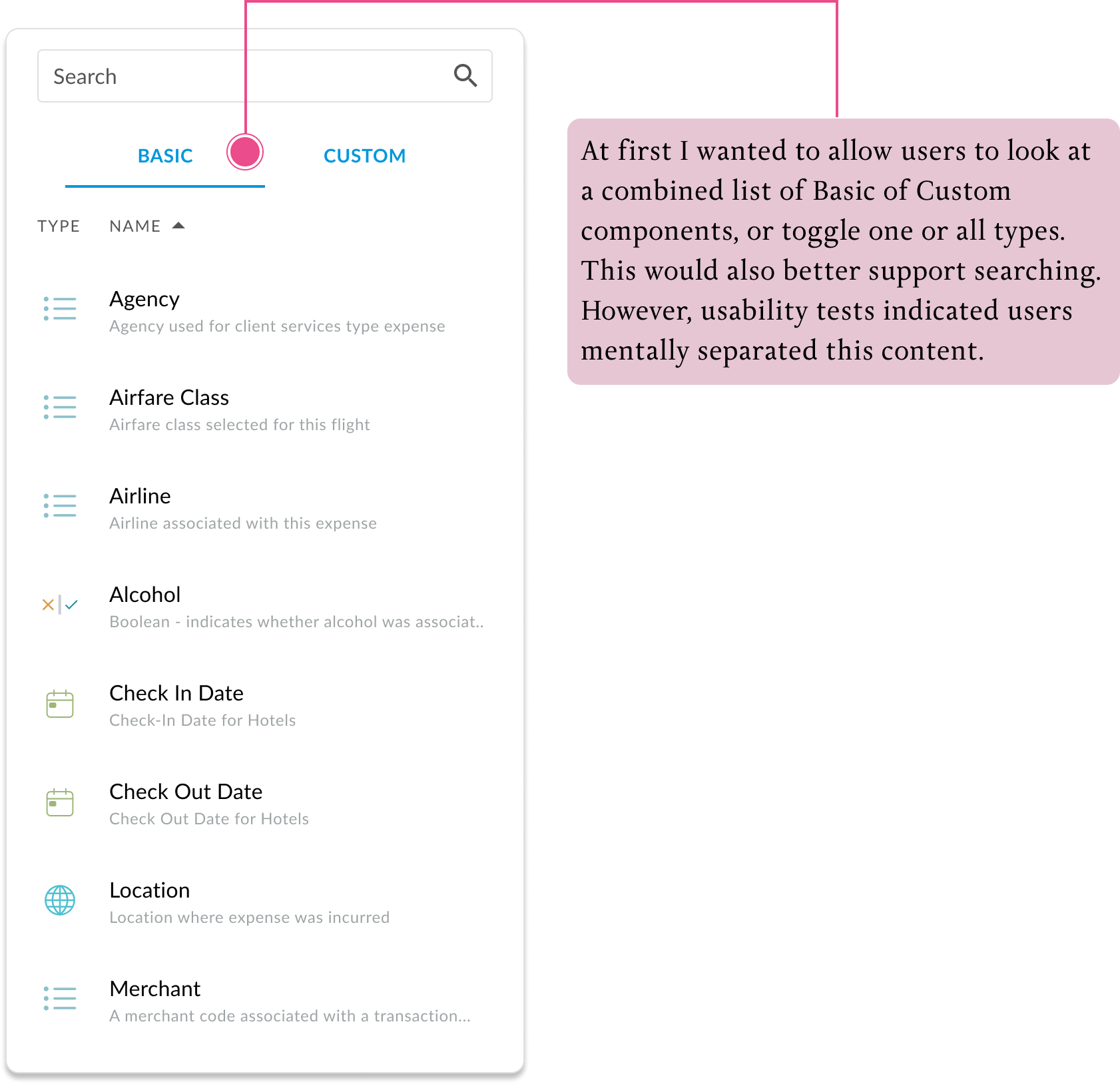
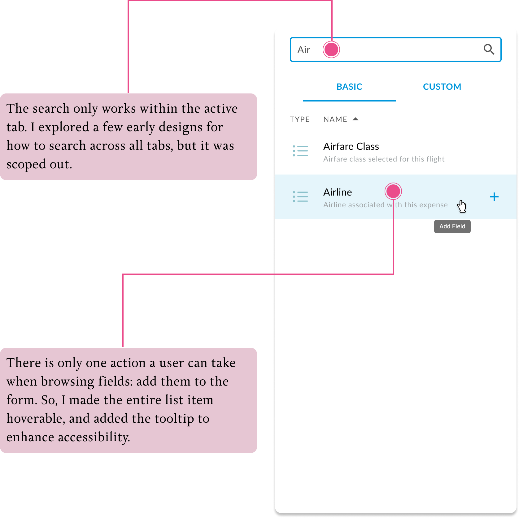
Forms are composed of fields, some are standard, some are custom. Clients needed to be able to search and sort through a potentially large list of these elements and add them into a form.
Also, they will want to differentiate between “Custom” fields, purposely made for their organization, and “Standard” fields available to any client/
Organizing and Rearranging Fields
Forms are composed of fields, which can be can be added, rearranged and deleted.
The list was sorted into three collapsible sections, separating rules from fields. This was preferable to tabs because it indicates that all of the content was part of one form. Additionally, tabs were already needed in the sidebar

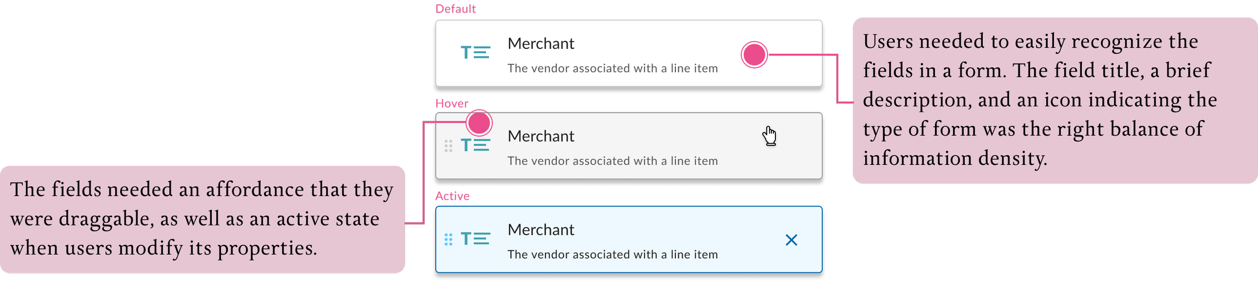
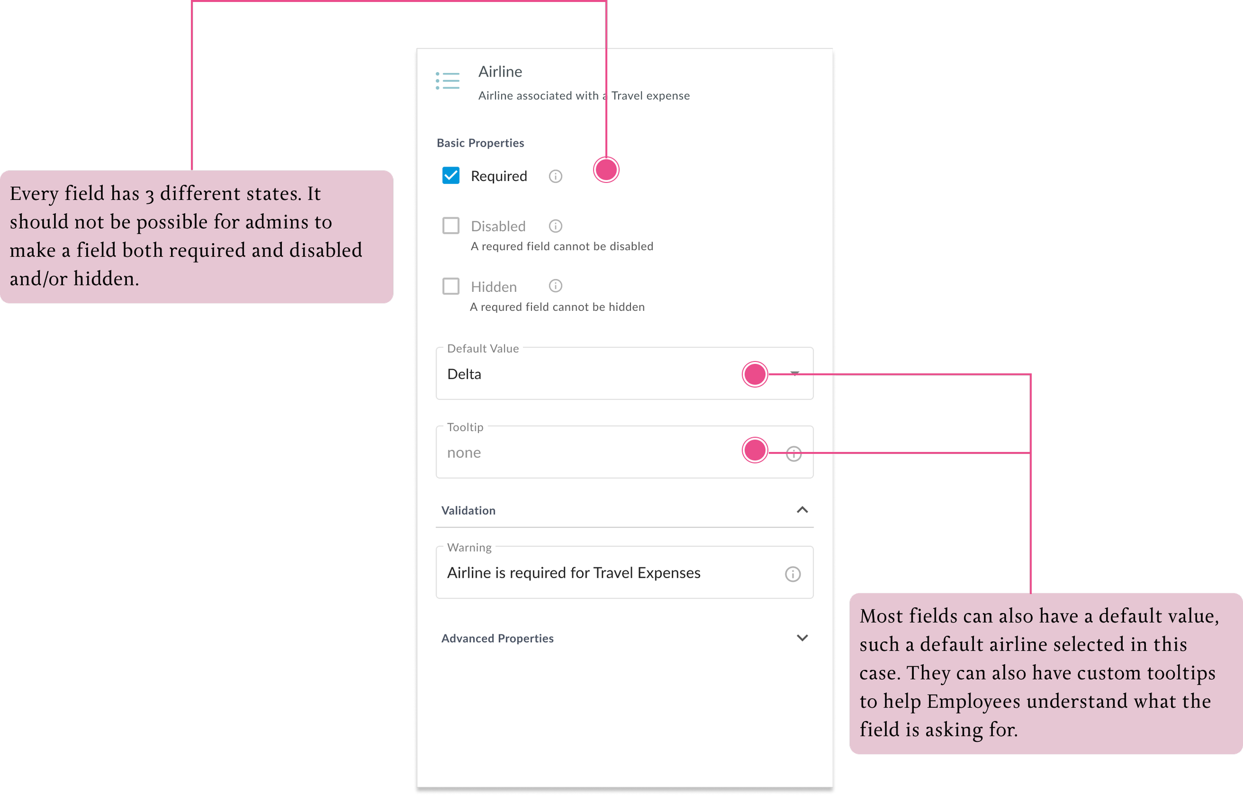
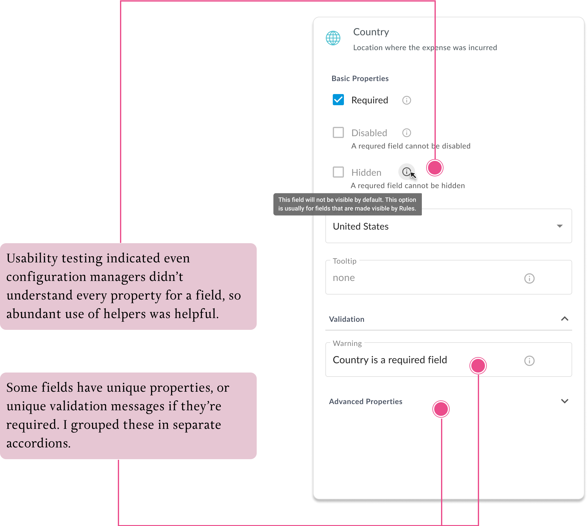
Editing Fields
Each field has properties. for instance, it might be a required field, or It might have a custom tooltip. It might may require a minimum number of characters. Not every field has the same properties. I had to find the most suitable interaction design pattern for editing these properties.

Supporting Rules
In addition to fields, forms can also have conditional logic controlling how it appears - Rules. Users would need to be able to see the Rules on a form, or add an existing one from the sidebar. For this release, the scope was constrained to just seeing there were rules on a form, and adding or deleting them. Support for looking at rules or modifying them was not yet supported. If users clicked a rule, I needed to show them something friendly telling we planned to support this feature soon. A designer on our creative services team produced the illustration.
The final deliverable is a significantly more usable version of the Form Builder, both for admins and for configuration managers. It also sets up resuable patterns to redesign other admin tools and make them user facing.