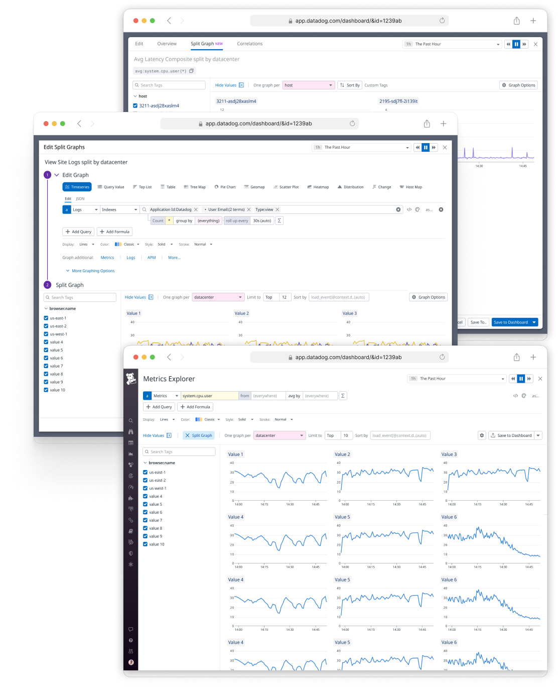
Split Graphs
Involvement: Design Lead, Product Design
🧑💻 Designed Spring-Fall 2022
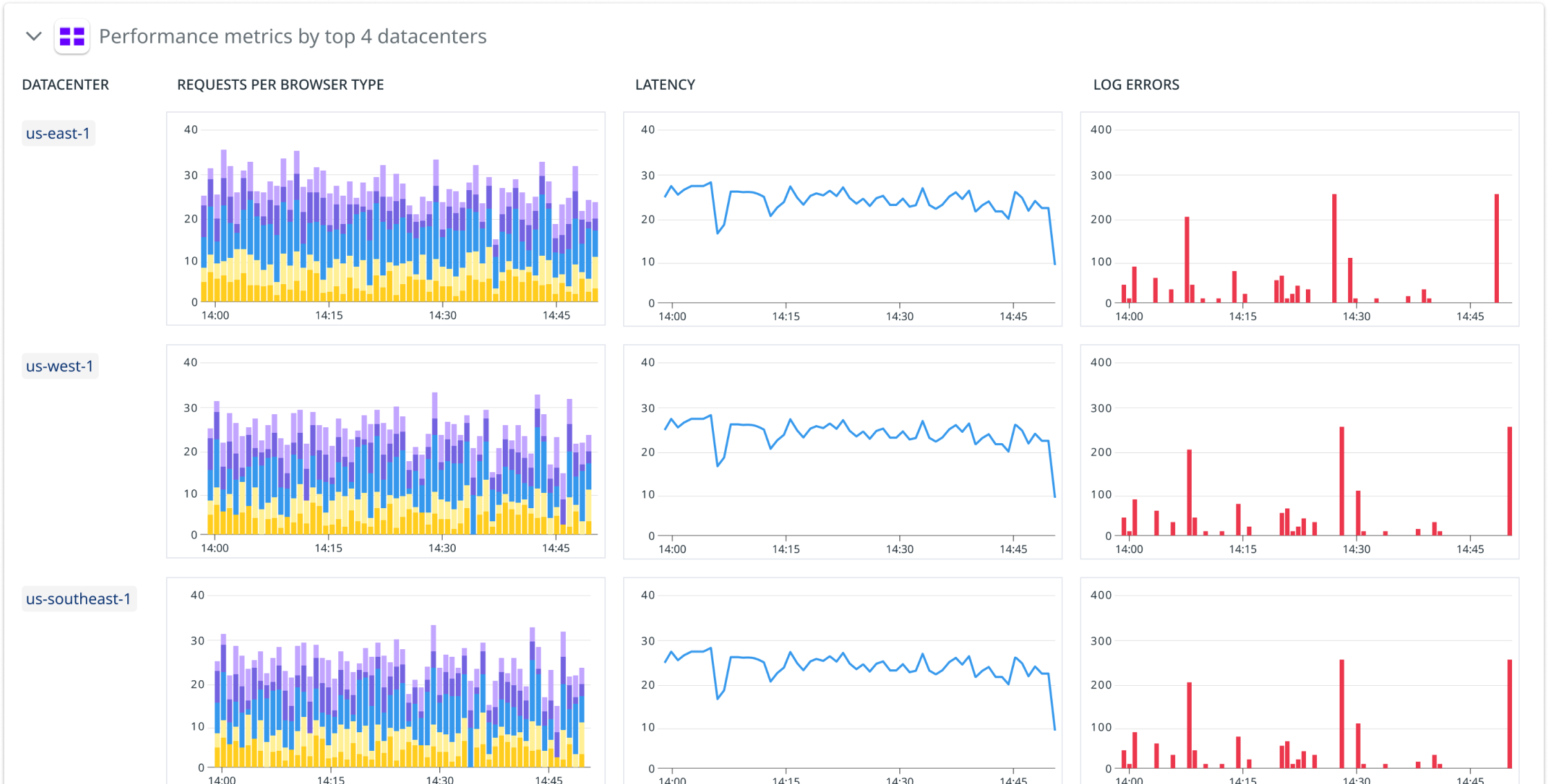
🚀 Launched Spring 2023Split Graphs allows users to take any existing graph and split it across a set of tag values. This shortens the time needed for investigations, and can help customers improve how they monitor their infrastructure within Dashboards.
Context
The Problem
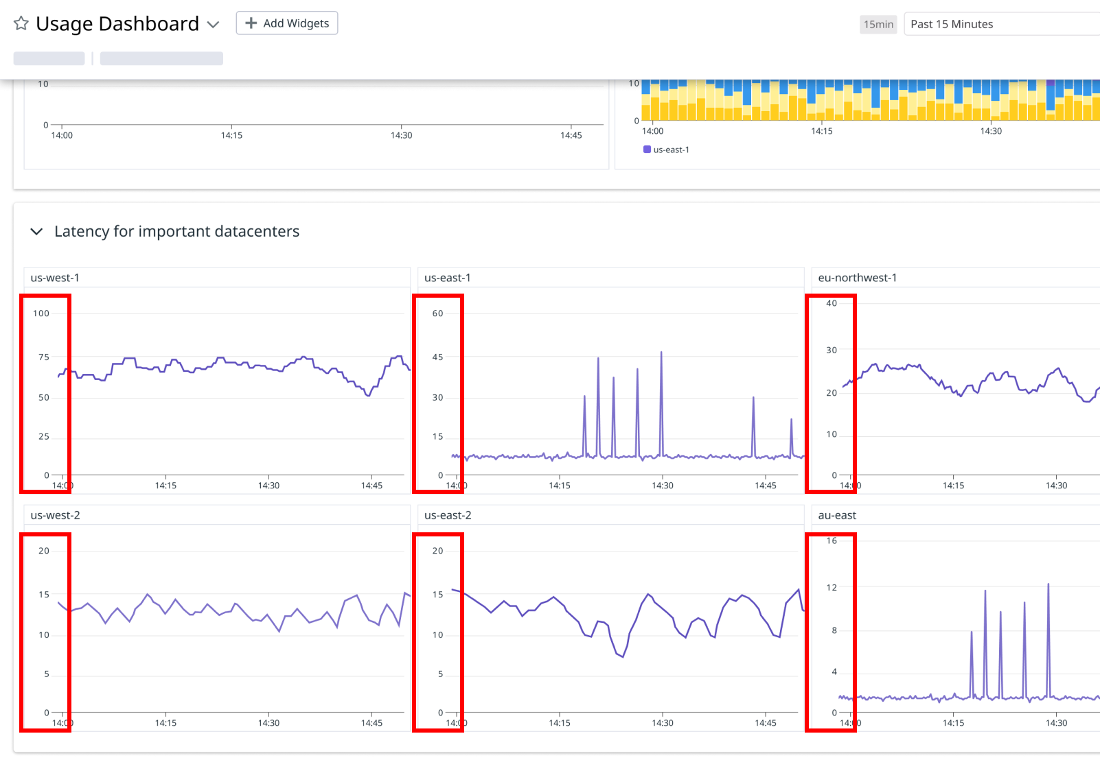
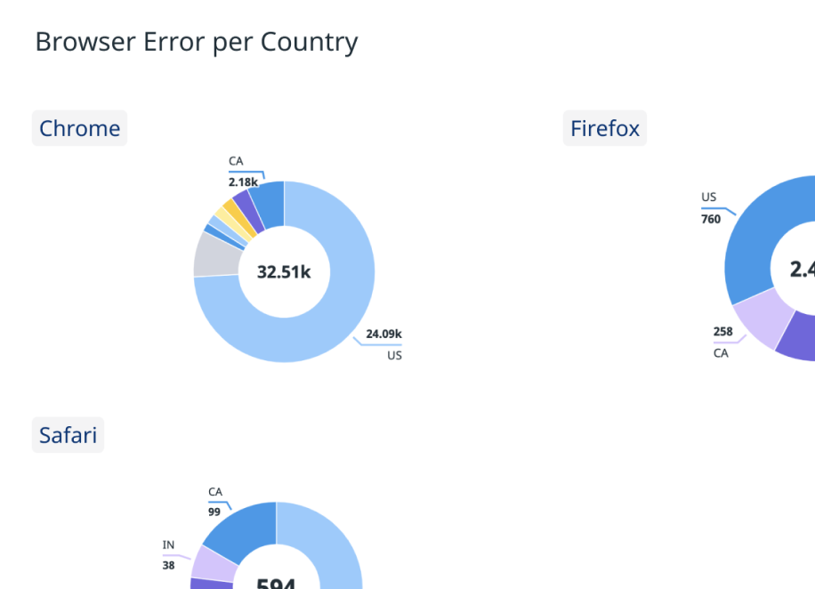
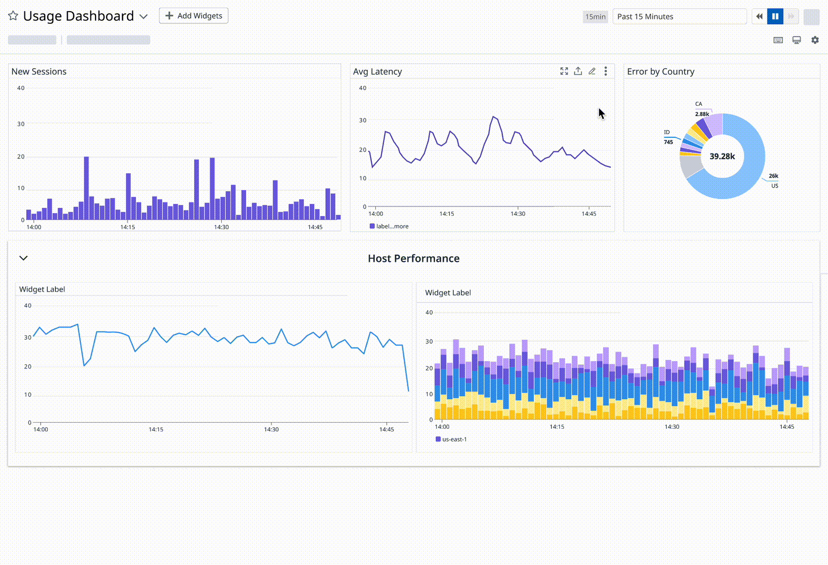
Metrics are rarely evenly distributed.
For example, if I looked at a graph of global carbon emissions, the bulk of it will come from a handful of countries.

Investigations explained
An investigation is any use case where an engineer is coming into Datadog because something is on fire.
In an investigation, engineers are trying to identify the root cause of an issue and resolve it. This often involves combing through different tag values to isolate where a problem is coming from.

Tags Explained
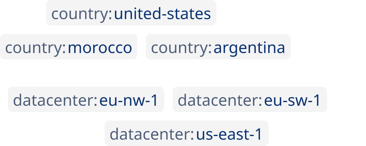
Tags are central to how data can be filtered and organized in the Datadog platform. It offers a way to filter down data or isolate it in an investigation.
The Workaround
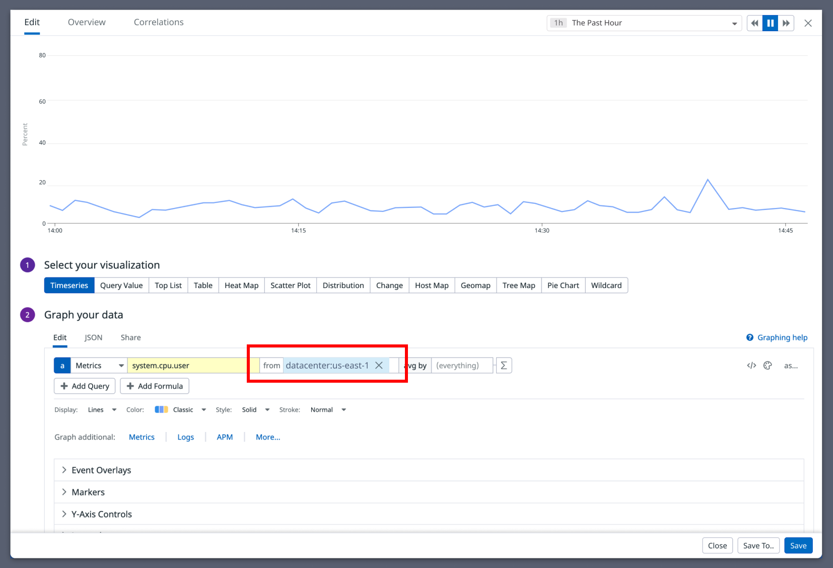
In order to investigate a latency spike, an engineer could keep changing the filter to different values in the graph editor.
If an engineer wants to compare these graphs or keep them for reference, they would create them one-by-one on a dashboard.
Another major UX issue here is that the axes on each graph will be different and harder to compare; they have no connection to each other.
1.
3.
Product Requirements
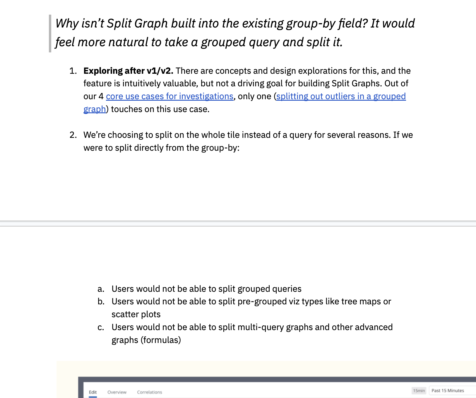
Support for splitting any dataviz type, not just just a timeseries.
There are many places where it’s useful to split different graphs. For instance, a user might want to see a distribution chart split. In order to make the feature more versatile, we opted to design it so that it’s essentially just copy-pasting the same graph with different filters applied to it each time.
Needs to look and feel like a consistent experience
Split Graph is a tool that was embedded into several Datadog products where it can be a useful utility. It was a challenge to make these tools look and feel consistent in different platforms.
2.
Needs to support two key use cases: investigations, and authoring.
We first focused on investigations because myself and product management agreed this was the biggest opportunity for impact. The findings here would help us fine tune how the feature works. Phase 2 involved saving this to a dashboard (authoring).
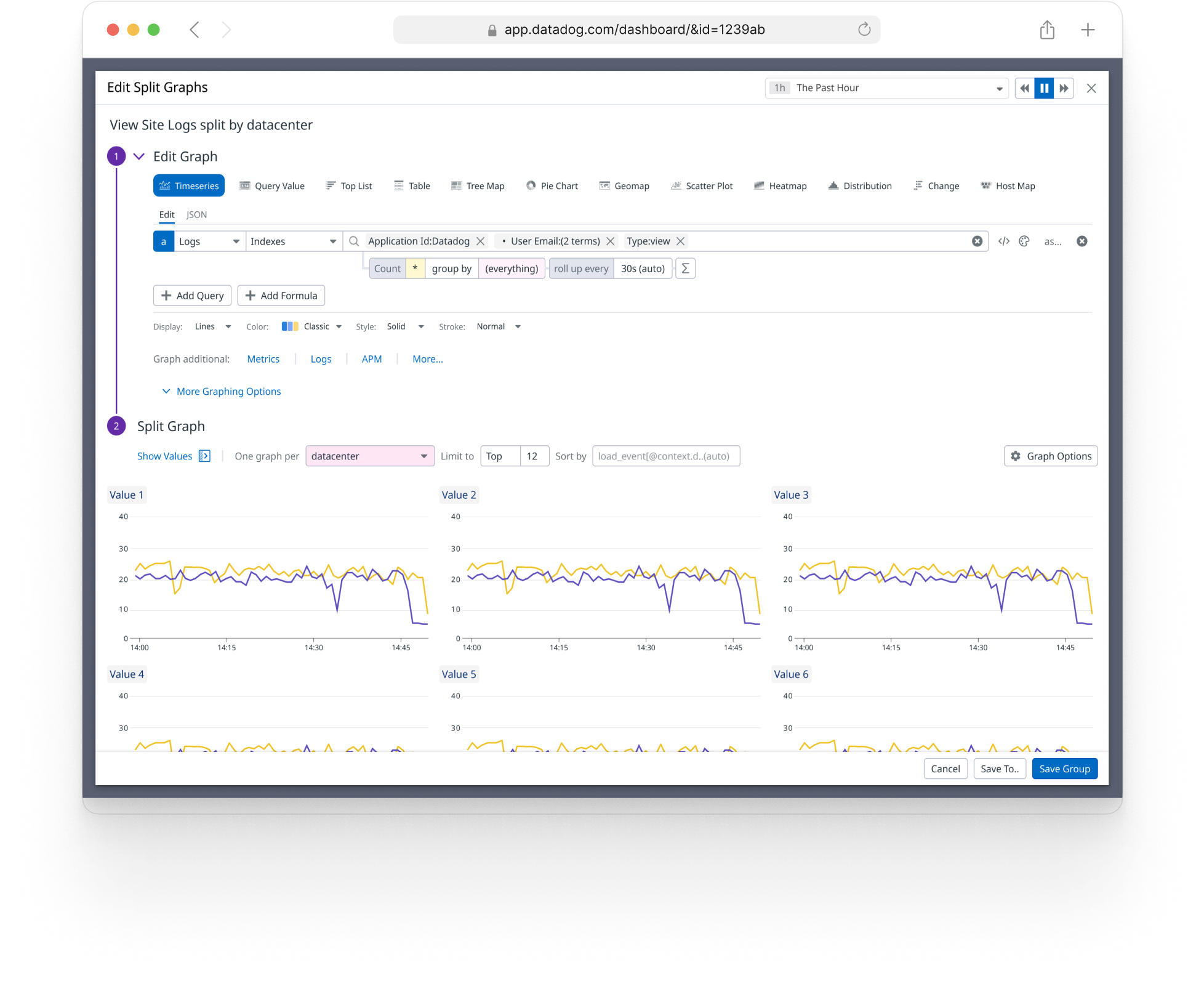
Design for Investigations
UX Flow (Investigations)
There are many ways an investigation starts and is resolved within Datadog. Looking at graphs plays a critical role in identifying Root Cause. So, being able to quickly compare the same graph across tag values speeds up the process.

Anatomy

Point of Entry
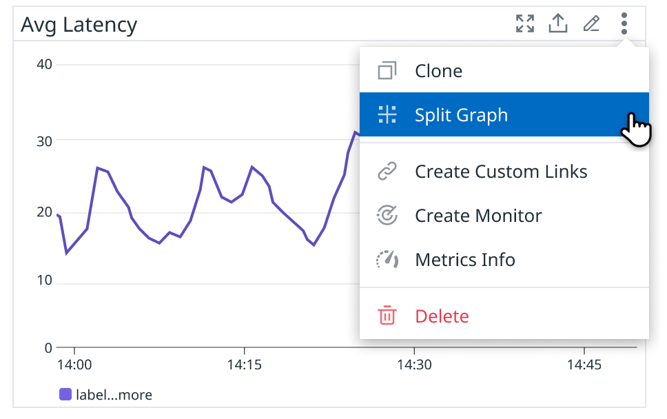
Placed in the kebab menu for several reasons:
It needs to work on the entire graph, not just a query within the graph.
It needs to be available without editing the graph.
There are other important primary actions in the widget header (it caused misclicks and confusion when added there).
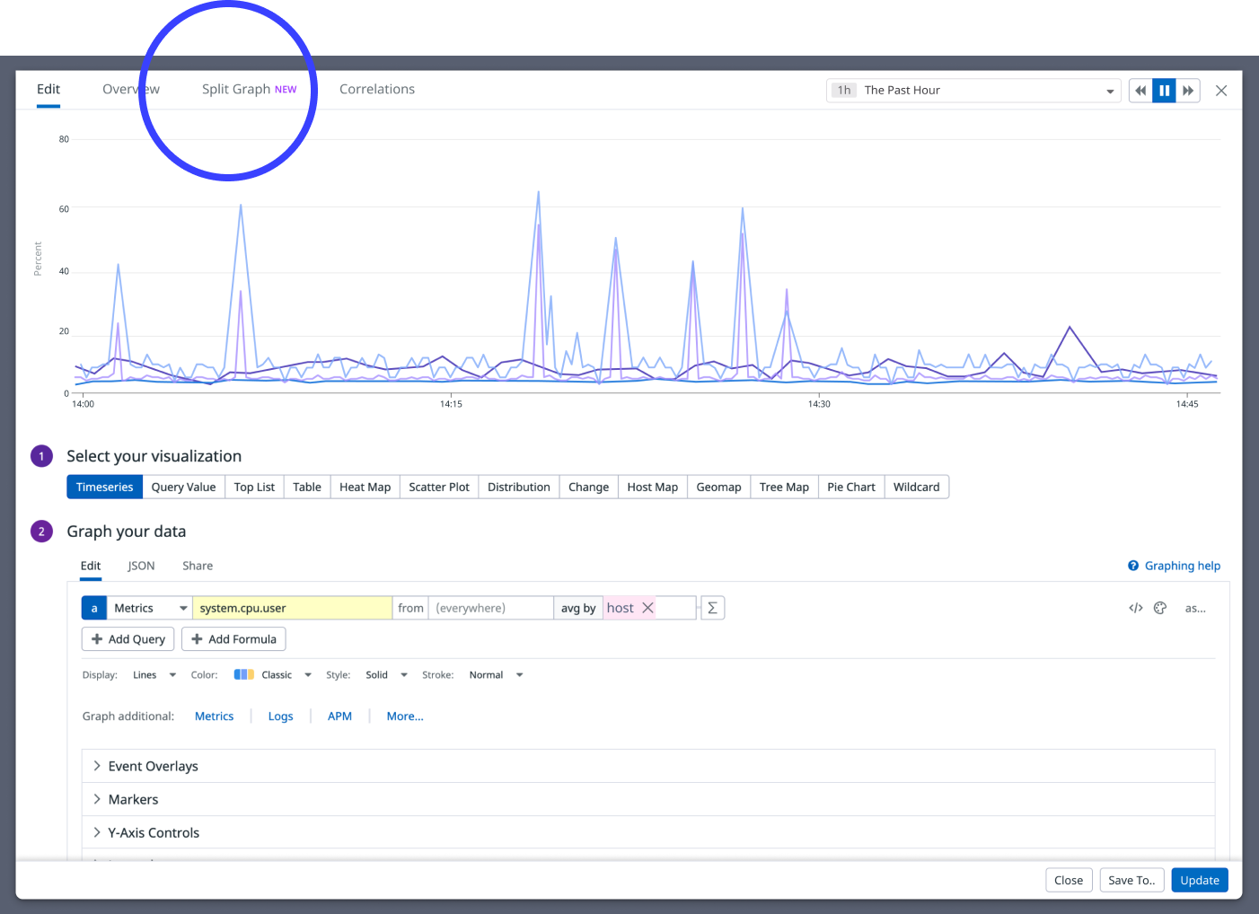


Alternative: Editor State
Initially rejected because:
complexity: it creates a lot of error states the editor doesn’t have to handle today.
makes major changes to the graph editor in order to fit this functionality in.
...but eventually once the project evolved more, we staged an adaptation of this work to replace the “Split Graph” tab.
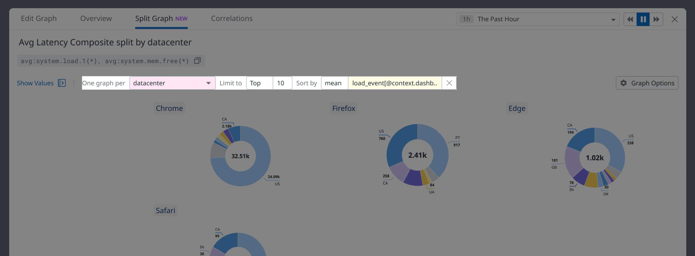
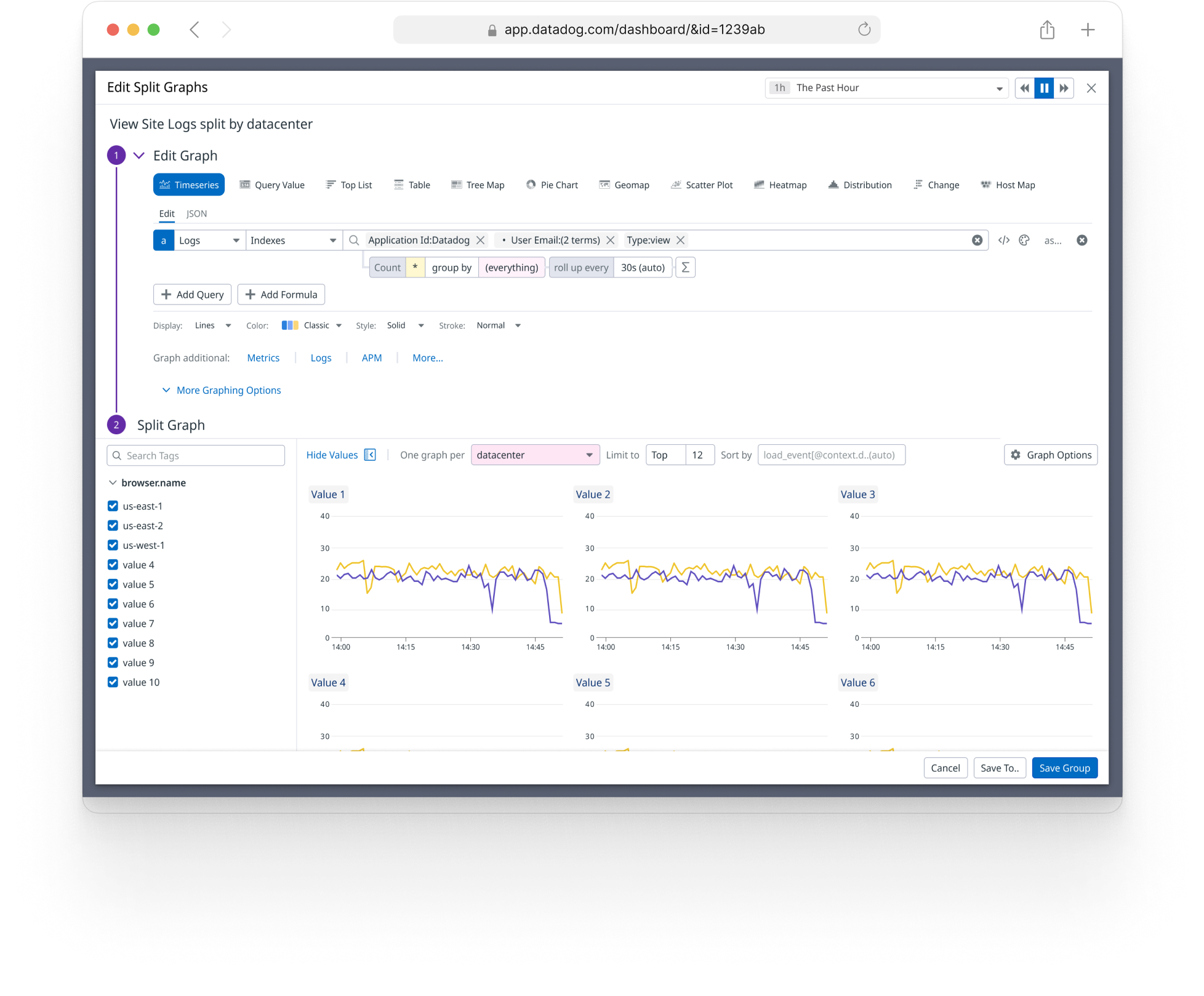
Sorting
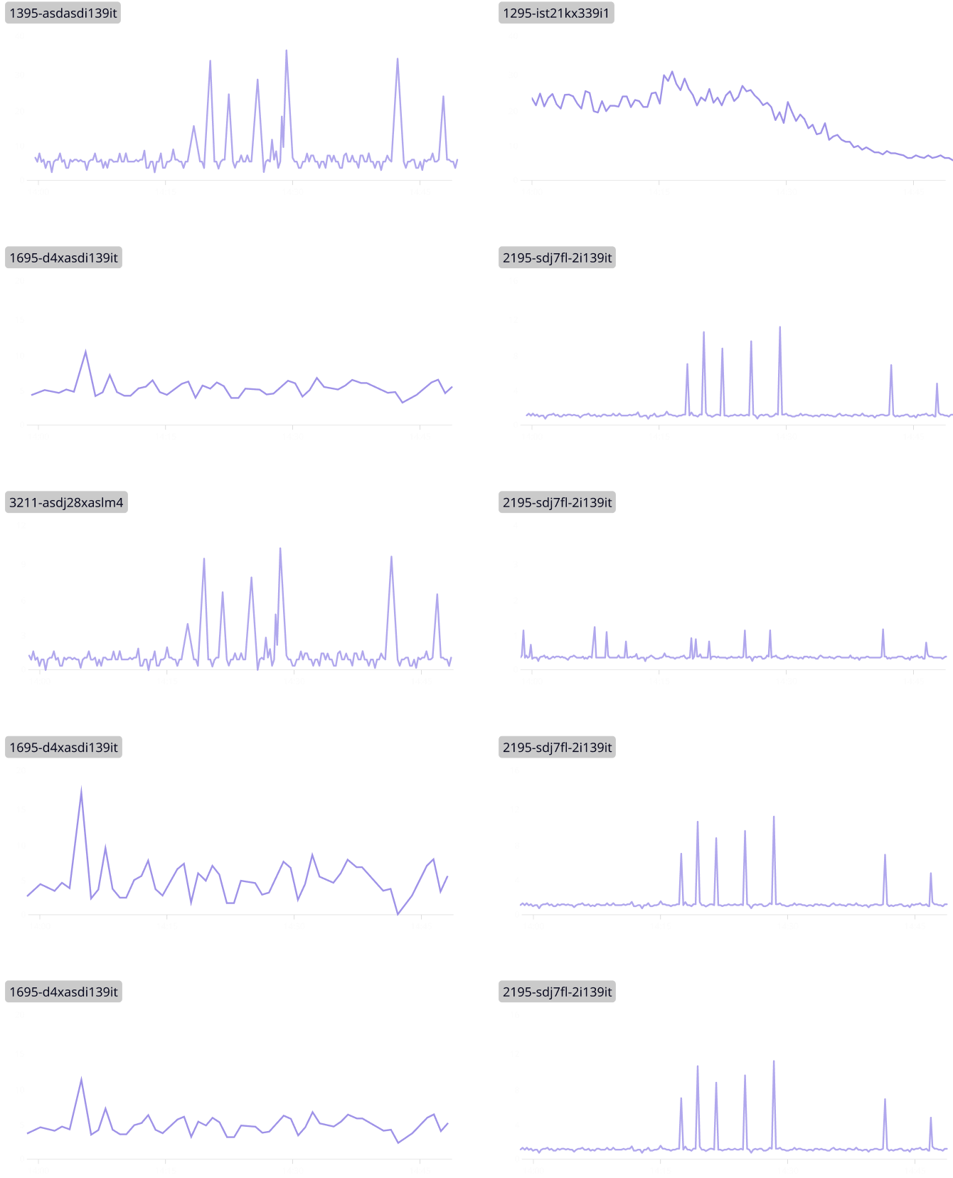
For performance issues, we can’t retrieve every tag value because there’s often thousands of tag values, so we agreed to a default limit of 24 results.
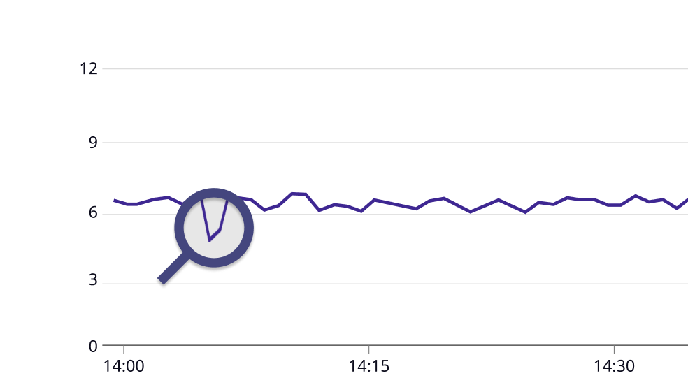
Sometimes a user needs more control. IE, instead of getting tags by total emissions, a user might want to see the countries with the highest populations or GDPs.
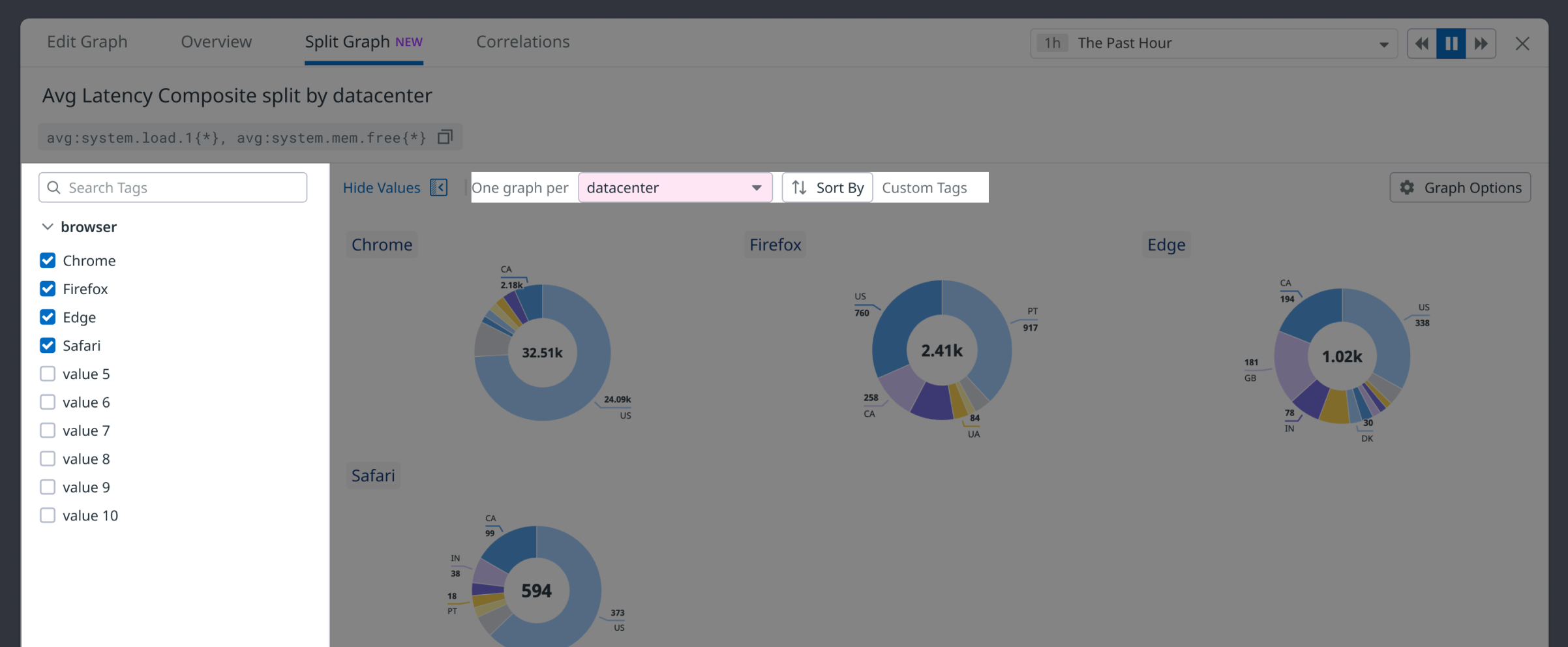
Sometimes a user prefers to choose tag values manually, rather than sorting them. The “Sort” field changes to indicate that nothing is being sorted.
Why Put it in a Tab?
It’s important that users can edit the graph because parameters here can affect what’s visible when splitting. I explored a few alternative designs before our team aligned on placing it in a tab.
Alternative: Sidebar
Rejected for several reasons:
needs to be available within the editor, which would require a sidebar in a modal.
became too cramped to support all of the controls we eventually needed.time controls can be important when splitting.
sidebar within a sidebar when viewing / selecting values manually.
not a lot of space to look at or compare graphs.
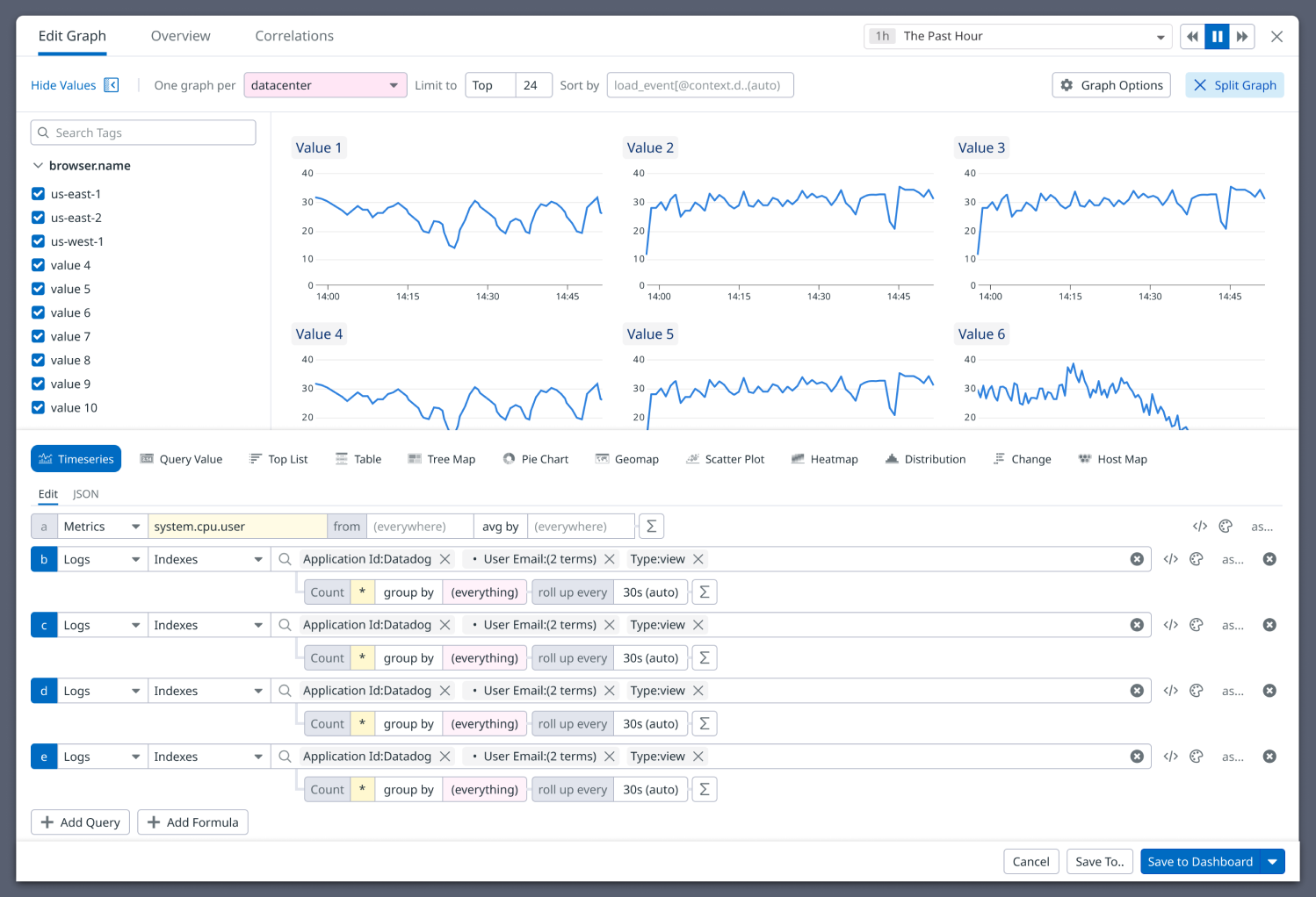
Usually, the most relevant tag values are on the metric they’re looking at. IE, if we’re looking at carbon emissions over a period of time, we want to look at the countries with the most emissions. We call this “implicit sorting”
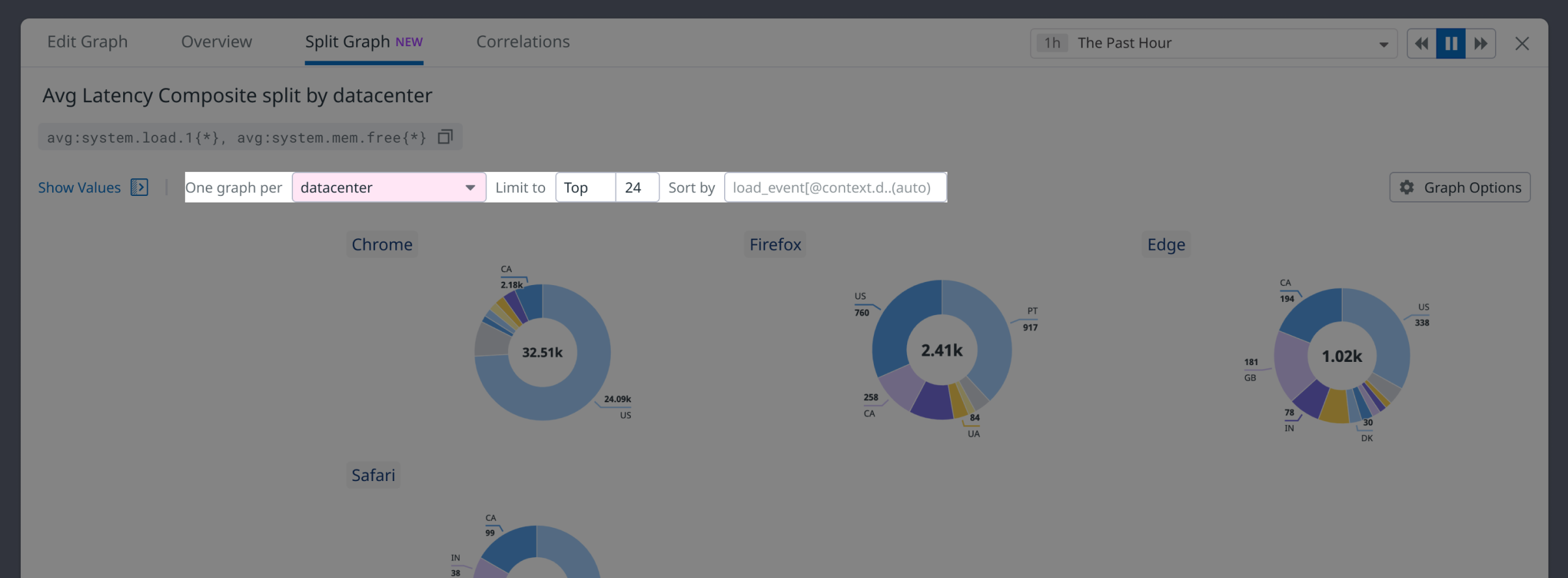
When a metric is distinct or needs attention called to it, the Datadog design pattern is to label it yellow. (grouping terms are labeled in pink). This is called “explicit sorting” because the sorting metric is distinct.
For convenience, it’s displayed as a button, so that the user can go back to sorting tags (whatever they were last sorting by)
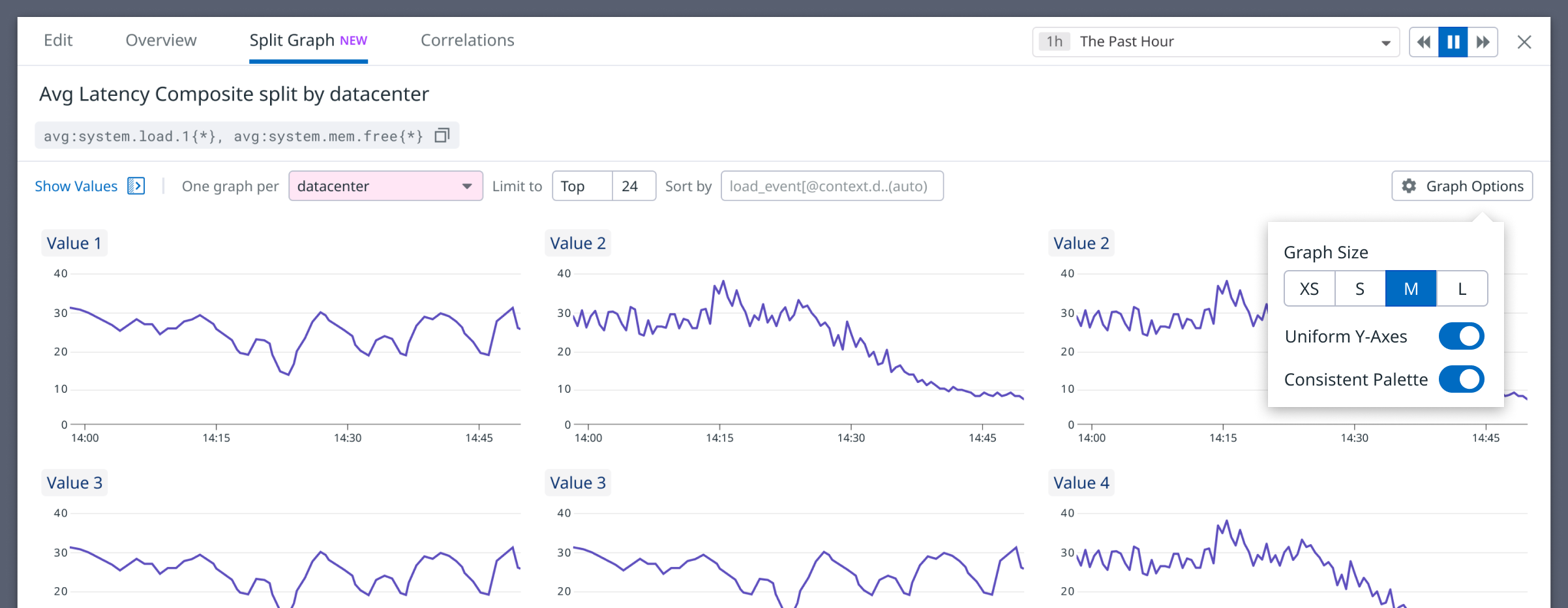
Graph Options
By the time the project matured, we landed several graphing options we needed to support for configuring the display of graphs, so these were placed in a popover menu.
Design Process
Communicating Design
This project was challenging in terms of complexity, scope, and the number of stakeholders, teams, and collaborators involved at various points in the project. This included two separate engineering teams, different product managers, branding, design leadership, and the CEO. Communication and alignment was one of the most important aspects of the project.
I managed communications within a Slack channel of 100+ participants where I responded to feedback regularly. I scheduled ad hoc design jams to iterate on designs in response to some of this feedback. I created and distributed various documents throughout the project to build alignment and understanding for new stakeholders who regularly got involved. This included maintaining a product decision log documenting some of the key decisions behind the design and why they were made, as well as an FAQ doc. All of this was crucial for onboarding new stakeholders and effectively aligning everyone.
Testing Insights
During testing, it was clear that people had a mental model that closely associated “grouping” on a graph, with Split Graph functionality. Engineers often expected to create or change a split definition by creating an avg_by term on the graph itself.
If there is a grouping term on a graph, that is what the user is most likely to want to split by. Across the board, we updated Split Graph to take grouping terms into account when choosing a One Graph Per field. This means the editor would do what the user expected, without any downsides or need to create heavier affordances or differentiation in the UI.

If the One Graph Per field is still default, ie the user hasn’t explicitly selected one, the editor now automatically updates this field when this type of change happens on the graph.

Part 2: Split Graphs as Dashboard Content
I have a graph of new subscribers by country, the top countries change, so I don’t want to keep recreating the set of graphs.

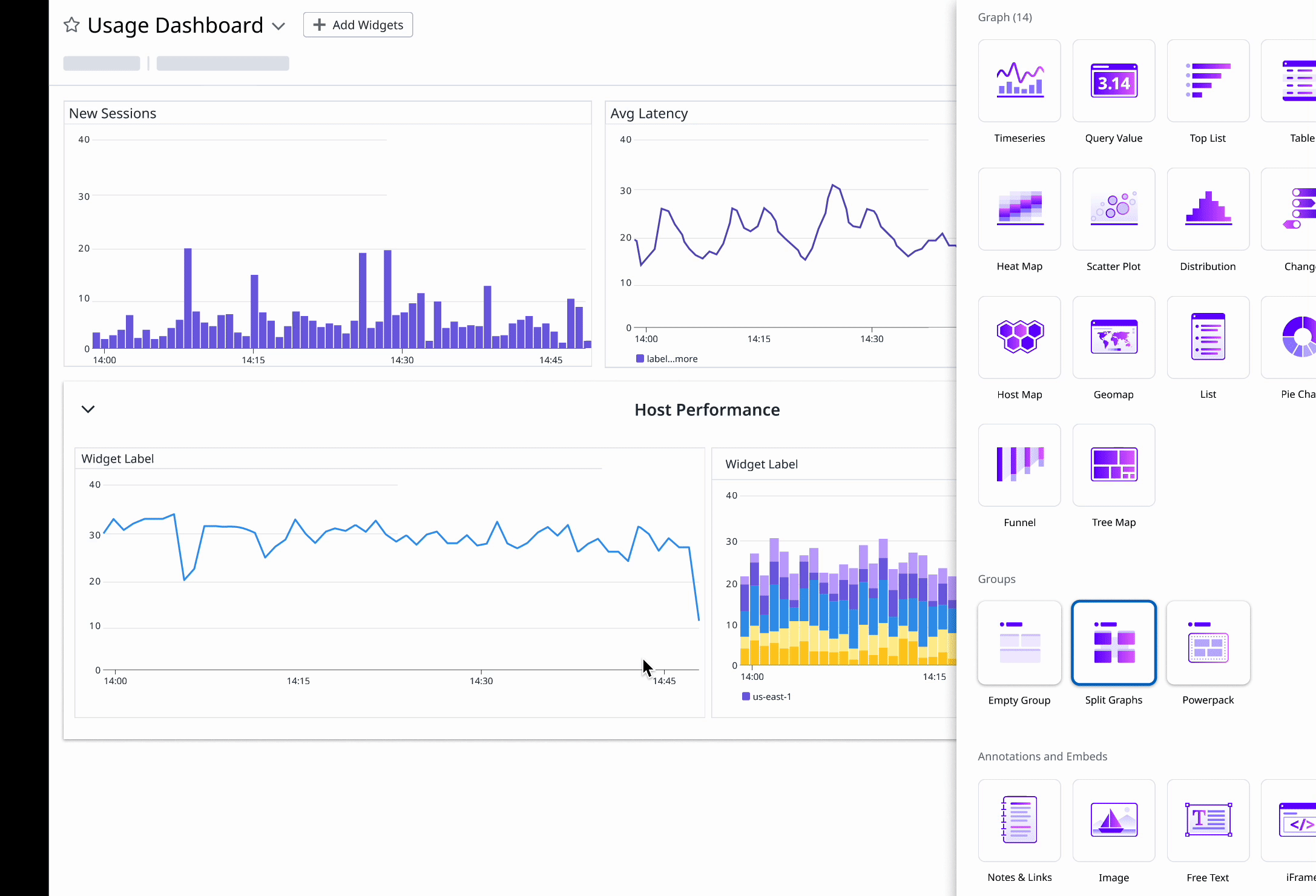
Widget Design
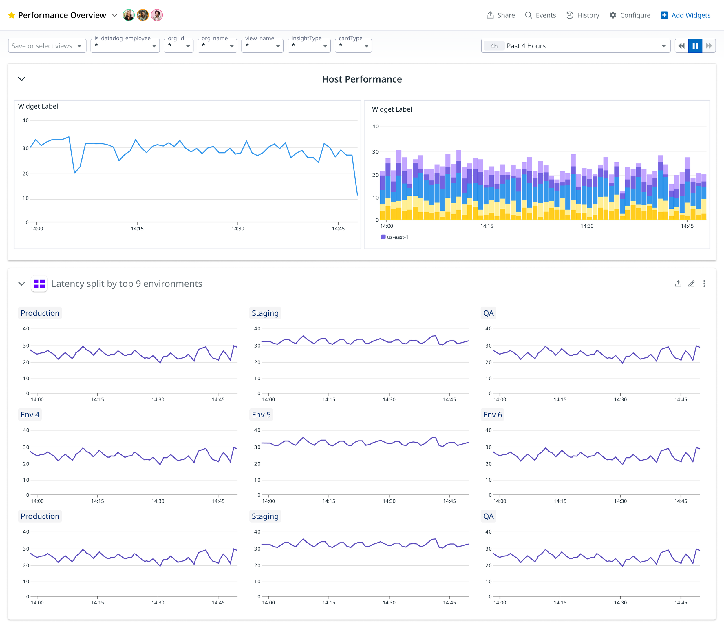
Grouping is a way for users to organize different widgets on their dashboard into a meaningful way. Split Graphs repurposes this.
Split groups are always one graph being repeated across tags. The tags are refreshed when the page refreshes. The graphs have a consistent size.
A user might want the graphs to persist and be able to edit the group. There is a “detach” function in the kebab menu to convert this to a regular, editable group of graphs.
Creating and Editing a Split Graph Widget
Often a user wants to persist a group of repeated graphs. Sometimes, they find the graphs in an investigation (graph editor tab) and want to save it. Sometimes they know ahead of time they want to create a set of split graphs.
In either case, the main design challenge is creating an editor for this type of content. There’s always a graph, as well as a split definition, that can be edited at any point.


With so many dense editing options available, one design choice I made to de-clutter was to put the Edit Graph options in an accordion. If the user is creating a Split Graphs widget by dragging onto the screen, they likely want to edit the graph so that accordion would be open. However, if a user wants to edit an existing group such as in this use case, they’re less likely to edit the graph, so it’s closed.
A big challenge in this design was considering scrolling behavior and where elements like the sidebar for selecting tag values might be anchored on the screen.
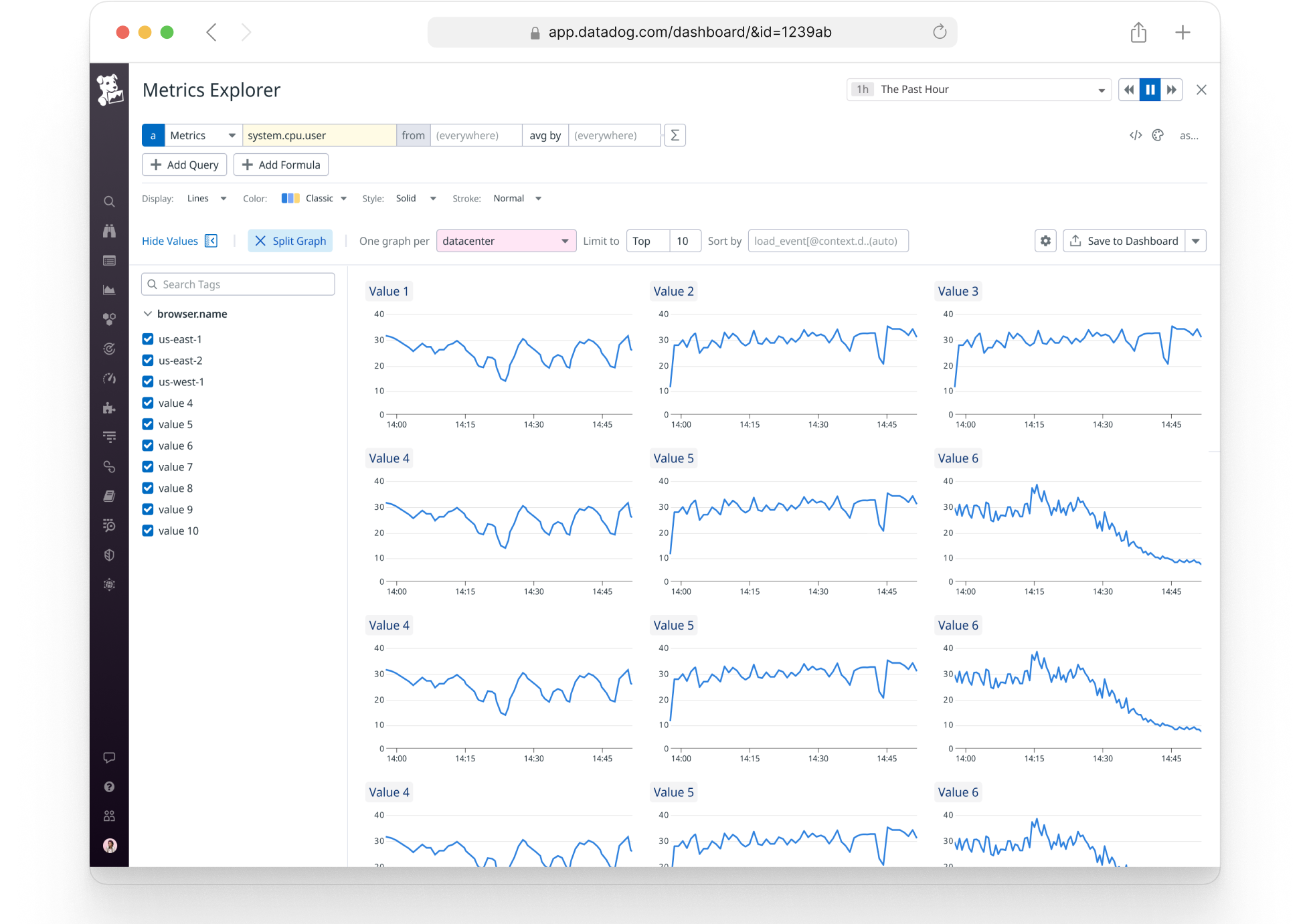
Split Graph is a utility available in several contexts in Datadog, I had to design it in a way that the experience felt consistent across those different use cases, such as the Metrics Explorer pictured here.
Product Validation
Split Graphs was a long awaited feature available in many competitor’s products. So, it was quickly adopted and used both internally and by customers. It is one of the fastest growing features on the platform today. This improved Datadog’s retention and ability to sell the product.
This project presented many design challenges and new paradigms. In the process of designing this project, I introduced new patterns to our design system, and the experience of editing graphs. For example, I introduced the ability to edit a title inline, which replaced the normal input box. I also introduced better ways or sorting and filtering tags which can be applied in many Datadog products.
Future Improvements
Future work will focus on incorporating splitting methods options into graph editors and other dataviz types. For instance, users can be more granular about which segments appear in a pie chart. Another important piece is to support splitting multiple graphs at once, which was originally included in the scope of this projects. This added a lot of complexity to the experience, so it was cut when development began. There are dashboard-level capabilities (template variables) that conflict with this capability too, so this method of splitting multiple graphs did not get alignment, and needed more design work. Nonetheless, competitors offered a similar feature and it’s the biggest feature gap. There are many design opportunities and challenges in making this type of experience work well, so my designs would invariably change a lot to support it.