Dashboard Version History
Involvement: Design Lead, Product Design🧑💻 Designed Summer 2022
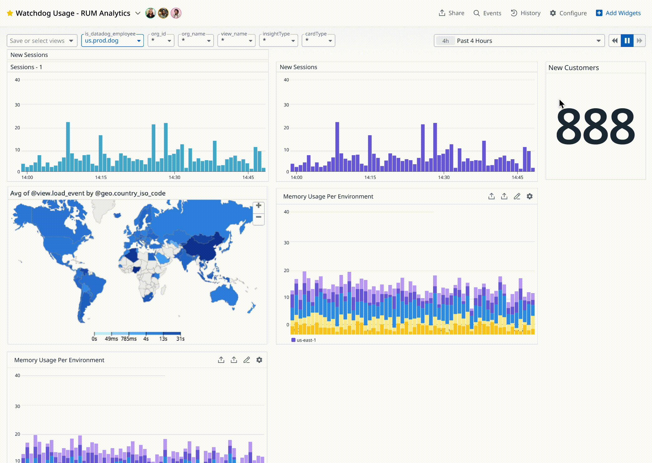
🚀 Launched Spring 2023Dashboards play a crucial role in monitoring and visualizing complex data, providing insights to inform critical business decisions. However, managing changes and preserving historical versions of dashboards has posed a unique challenge. At Datadog I designed a version history feature specifically tailored to address the needs of dashboard management, enabling users to effortlessly track, review, and restore previous versions of their dashboards. I’m pleased to say this is quickly becoming one of the most used features on Dashboards in 2023.
Product Context
In organizations utilizing Datadog, dashboards often serve as critical tools for monitoring and analyzing complex data. However, with often many team members granted editing access, tracking and distinguishing changes made to a dashboard becomes challenging. Users face difficulties in identifying modifications such as resizing graphs or altering queries, especially when these changes are made without the dashboard owner's awareness.
Competitors in the market do not offer a comparable solution. This presented a unique opportunity to address a significant pain point for Datadog users.
User Needs


Identify when graphs changed and which ones
Understand the differences between each version
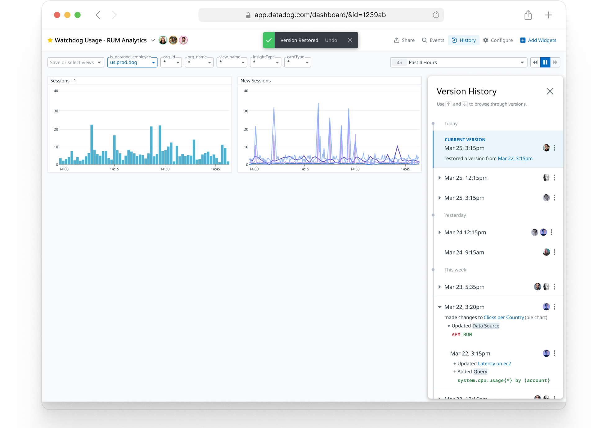
Restore versions
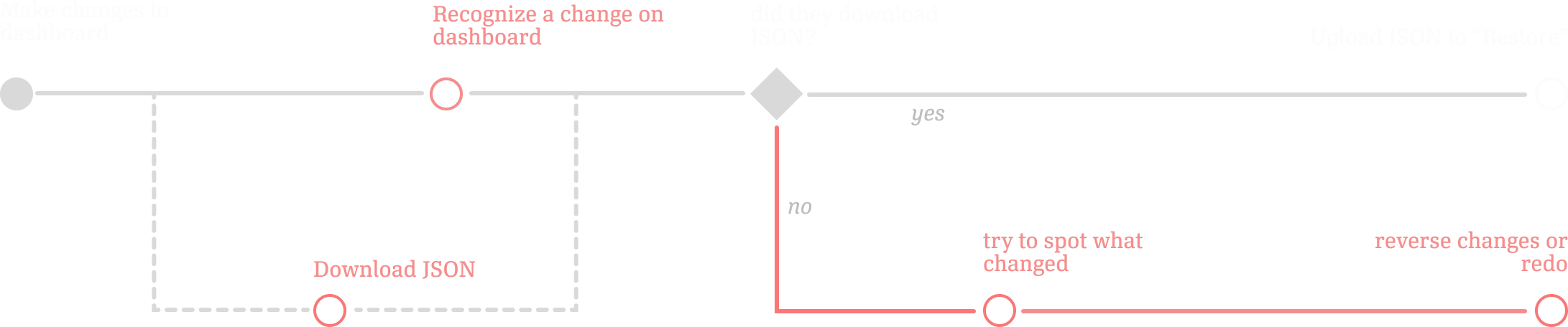
Prior Workflow
“ I don’t want to lock things down, but I also want to be able to revert if they mess things up. What I have to do now is, every time I make a change I export to JSON. Locally, I have a billion JSON files. If anyone messes something up, I restore from JSON.”
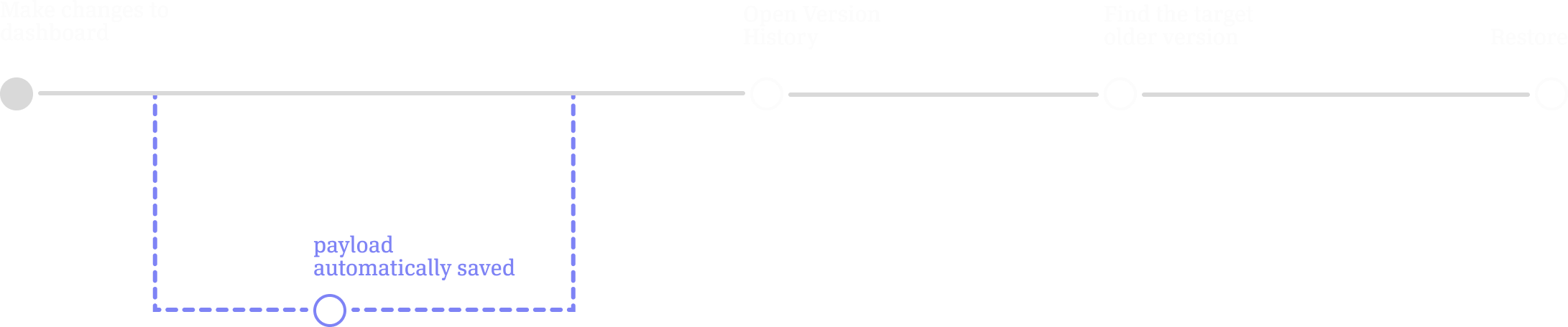
New Workflow
Dashboard version history works similar to other products with version history. All changes to a dashboard are saved as a version. A user can go back, look at an old version of a dashboard, and restore.
Background Research
I looked at Version History products in Google Docs, Figma, and Notion to understand some different approaches to:
Describing and highlighting changes between. versions
Representing a preview of older versions
Compressing the timeline of versions
how to represent the current, or most recent version.
Internally I worked closely with the engineering team to understand how versions would be created and stored, as this was a major constraint on the design. This was an ongoing effort that heavily influenced product requirements:
understanding payload JSON, what constitutes a “version.”
understanding how this architecture should scale to other Datadog products.
understanding how these are stored (write once, no modifications or deletions to previous versions)
I interviewed engineers at Datadog to understand some scenarios where they recognized an unwanted change and had to undo it. This heavily informed the design of the product, in terms of how to represent diffs / previews, and how to summarize many concurrent changes.
Design
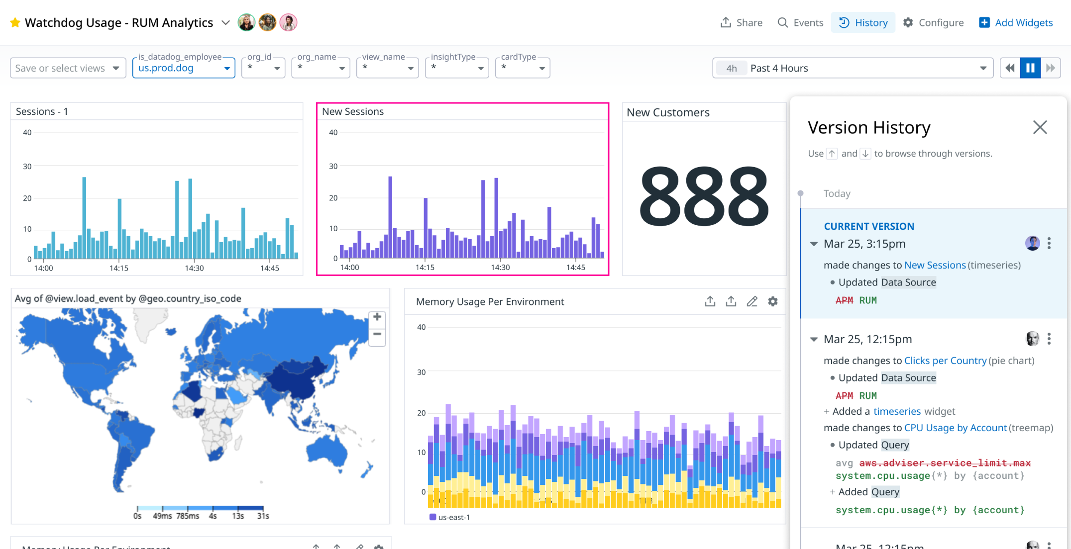
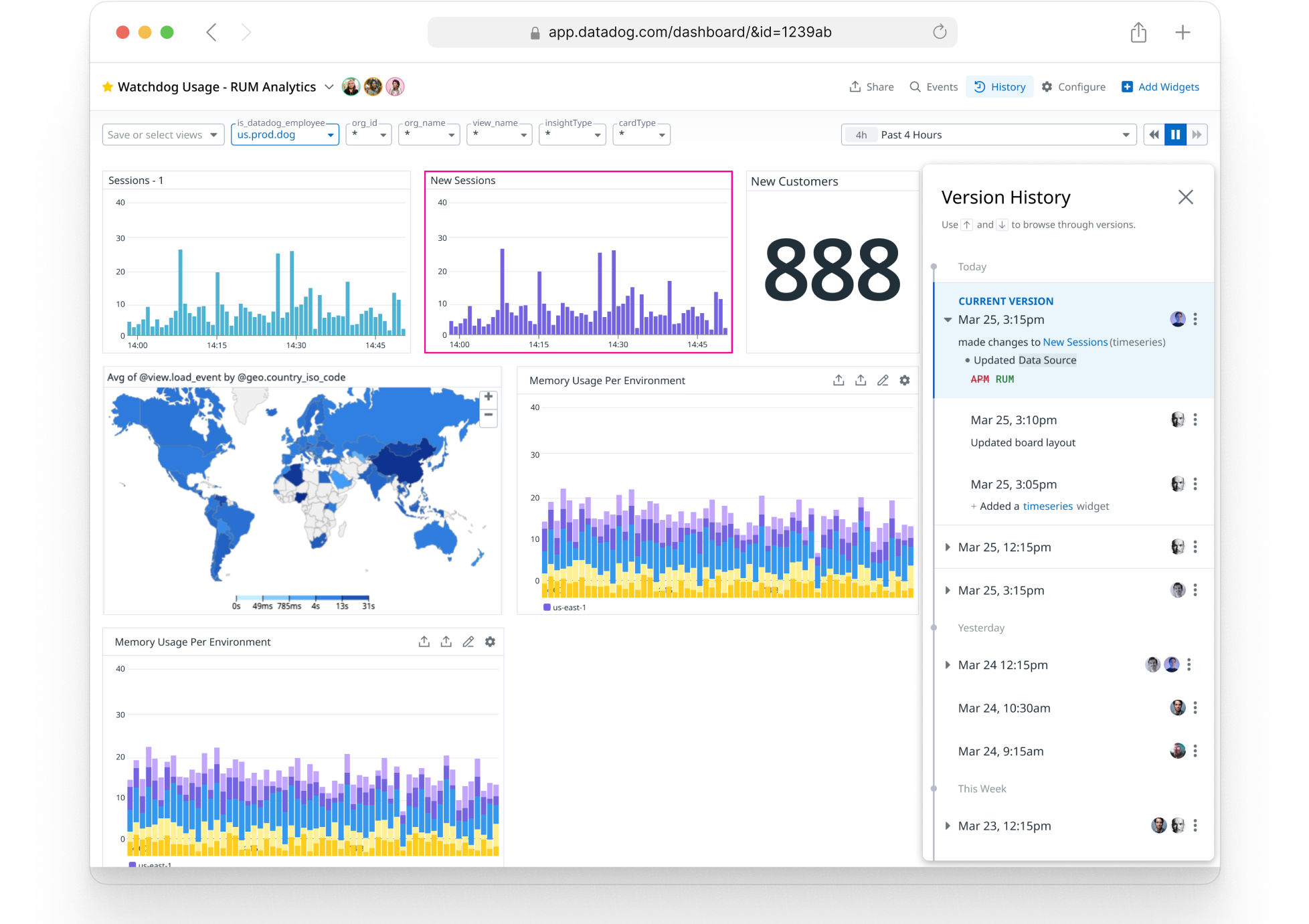
dashboard widgets scale down to fit the whole dashboard on the screen when versions are open.
the widgets that changed in a version are highlighted.

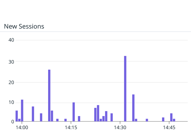
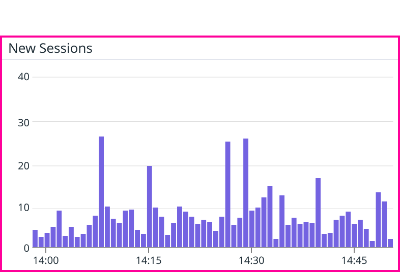
Often a change isn’t visually apparent. Diffing helps users understand specifically what changed between versions.
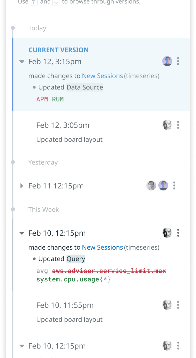
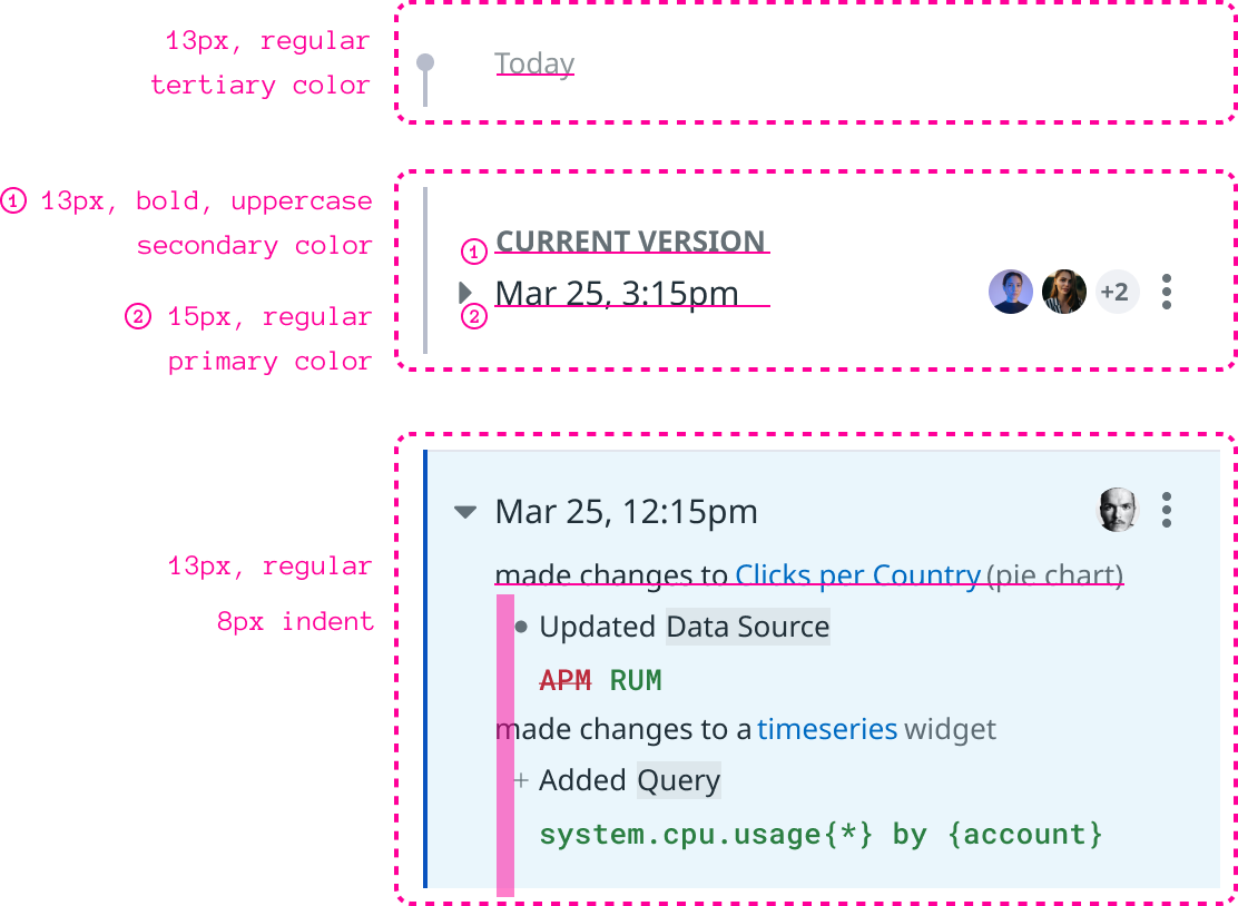
I worked with engineers to understand the information in payload JSON and try to summarize changes where possible. This involved categorizing different types of changes, and making the copy as concise as possible.
One guiding principle was to show descriptive information where changes aren’t visually apparent, and show less text when changes are visual. For example, “Updated board layout” is one case I carved out. If users move widgets around on the dashboard, the diff would not be very informative if it described how every widget’s position moved. In that case, the preview of that version tells the story much more clearly.
For accessibility purposes, these types of changes also needed to be described on widgets for visually impaired users, so the full payload JSON is useful for creating those descriptions within the preview.
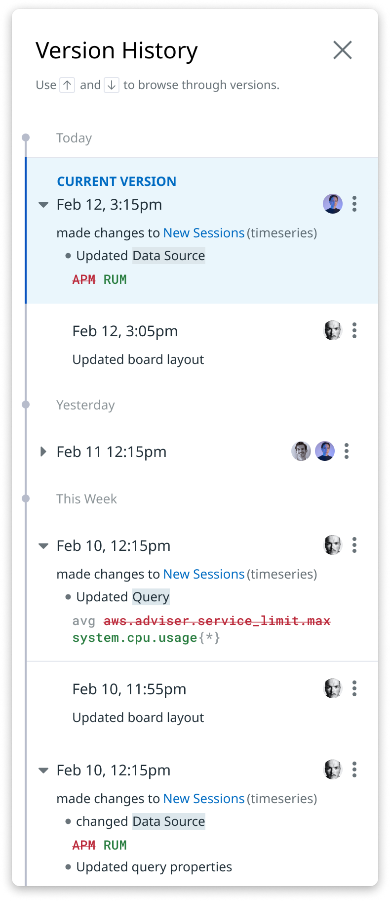

A dashboard is frequently changed a few times in quick succession.
I introduced rollups into the design to simplify history and make it easier to see significant differences between versions.

Visual Design
Version History is information dense. There are many visual affordances required, and it’s challenging to keep all of that contained. I relied on a solid typographical hierarchy to help users scan through versions. I only use two font sizes in the list, and rely on weight, color, and indentation to create variation where need.

Product Validation
We have access to rich data about how many versions were being saved per dashboard, and the most common types of changes being made, or reverted. This was critical for fine tuning diff copy and rollup behavior.
Some key product analytics questions we answered to validate the product and make changes:
how many dashboards have versions in the last 30 days (the retention window)
how frequently do dashboards change after their initial setup (diminishing number of edits).
how often do people restore a version, and how often do people take other actions like copying widgets from an older version.
whats the correlation between active users on a dashboard, and number of restores (high correlation).
Product Outcomes and Next Steps
Version history is quickly becoming one of the most popular features on Dashboards. Since competitors don’t offer it, it’s a valuable stickiness feature keeping customers loyal to Datadog.
Here are some next steps on the roadmap for Version History, or things I would have worked on next:
allowing users to look at version history for an individual widget instead of a dashboard.
scaling Version History so that it’s supported on different Datadog products where users make a lot of configurations, such as Monitors.